LinkedIn posts, comments and profile fields have no bold button. To bold text on LinkedIn, you paste in Unicode bold letters: type your words into a bold text generator, copy the bold version, and paste it where the plain words were.
That is the whole trick. The free LinkedIn Bold Text Generator shows your words in ten styles side by side, each with its own copy button. The rest of this page is the reference you come back to, then the details most tutorials skip: what these characters actually are, why they can hurt search and accessibility, and how to use them without causing either problem.
Quick reference
| Where on LinkedIn | Real bold available? | Unicode bold works? | Our advice |
|---|---|---|---|
| Posts | No | Yes | Bold the hook or one key line |
| Comments | No | Yes | One short phrase at most |
| Messages | No | Yes | Usually skip it, it reads as shouting |
| Headline | No | Yes | Keep it plain so search can match it |
| About and experience | No | Yes | Short section labels only, if anything |
| Articles and newsletters | Yes, in the editor | Not needed | Use the editor’s own bold button |
Articles and newsletters are the one place with a real text editor, so there you should use its built-in bold. Everywhere else, Unicode letters are the only option.
Bold a line in a post, start to finish
- Write the post in plain text first. Formatting is the last step, not the first.
- Decide which words earn the bold. Usually that is the first line, because it shows before the “see more” cut.
- Paste those words into the Bold Text Generator. If you would rather work on the whole post at once, paste it into the Text Formatter, select the line and press B.
- Copy the “Bold (sans)” version. It sits closest to the font LinkedIn uses, so it looks like normal emphasis instead of a different typeface.
- Paste it into LinkedIn in place of the plain words.
- Check the result in the Post Preview before you publish.
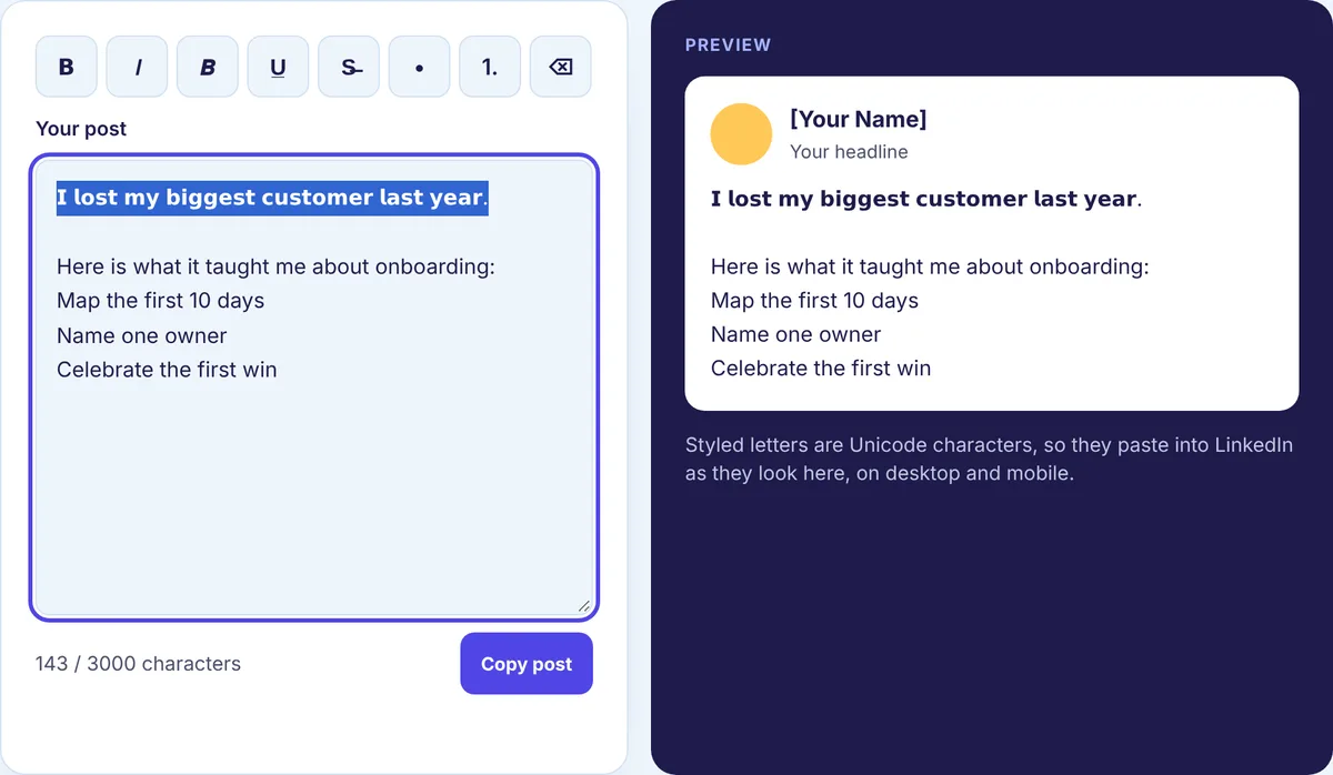
On a phone the flow is the same, just with an app switch in the middle. Open the generator in your mobile browser, tap the copy button next to the style you want, switch to the LinkedIn app and paste into the post or comment box. Copy and paste carries the characters over unchanged, because they are ordinary text, not formatting.
The four styles worth knowing
The generator offers ten styles. In practice, four cover almost everything people do on LinkedIn.
| Style | Looks like | Good for |
|---|---|---|
| Bold (sans) | 𝗕𝗼𝗹𝗱 𝘁𝗲𝘅𝘁 | Hooks and the one line you want people to remember |
| Bold (serif) | 𝐁𝐨𝐥𝐝 𝐭𝐞𝐱𝐭 | Short labels such as “Step 1” or “Result” |
| Bold italic (sans) | 𝘽𝙤𝙡𝙙 𝙩𝙚𝙭𝙩 | A single word you want to lean on |
| Italic (sans) | 𝘐𝘵𝘢𝘭𝘪𝘤 𝘵𝘦𝘹𝘵 | Quotes, titles of books, quick asides |
Script and monospace styles exist too. They are fun in a bio, but they get hard to read fast, so we would not use them for anything longer than a word or two.
What a bold letter really is
This is the part that explains every pitfall below, so it is worth a minute.
Unicode, the standard that defines every character your phone can show, includes a block called Mathematical Alphanumeric Symbols. Mathematicians needed a bold B that means something different from a plain B, so the standard gave them whole alphabets of separate characters: bold, italic, sans-serif, script and more. A bold text generator does nothing magical. It swaps each plain letter for its look-alike from that block.
What we checked in our own code
Our generator and formatter both use the same small conversion library, so we ran it on a few inputs with a short script and looked at what came out. Here is what it showed:
- The word “Bold” in Bold (sans) becomes four different characters: U+1D5D5, U+1D5FC, U+1D5F9 and U+1D5F1. None of them is the letter B, o, l or d as far as a computer is concerned. They only look like it.
- Each of those characters counts as one character by code point, but takes two units in UTF-16, the encoding many apps and websites use internally. So “Bold” is 4 by one count and 8 by the other.
- A 39-character hook, “I stopped sending proposals on Fridays.”, came out as 39 characters by code point and 72 UTF-16 units. Spaces and the period stay plain, which is why it is not a full double.
- Accented letters have no bold twin in that block. “café” came out as bold c, a and f followed by a plain é, so the last letter looks lighter than the rest.
- Underline and strikethrough work differently. They add a combining mark after each letter, so a four-letter word becomes eight characters.
- Turning bold back into plain letters gave us “Bold” again, exactly. The standard Unicode normalization that some software applies (called NFKC) also maps these letters back to plain ones, but you cannot count on every app or search box doing that.
Why the count matters
LinkedIn caps posts at 3,000 characters and comments at 1,250. Our Character Counter counts one per code point, so bold letters count the same as plain ones there. Other counters that count UTF-16 units will show bold text as roughly double. If you are close to a limit and the numbers disagree, leave yourself some margin rather than trusting the lower figure. The full list of limits is on our LinkedIn limits page.
Where bold text causes trouble
Search
Because a bold “Marketing Manager” is made of different characters, a person typing “marketing manager” into a search box may not match it. That is why we keep anything searchable plain: your name, your headline, job titles, skills and company names. Bold works fine in a post’s hook, because nobody finds you by searching your hook.
Hashtags and mentions
Our test turned “#marketing” into a plain # followed by bold letters. That is not the same hashtag as the plain one, so it will not connect your post to the topic. Mentions are created by LinkedIn’s own picker, so type those normally. If you want hashtag help, see how to use hashtags on LinkedIn.
Screen readers
Each of these characters carries its own formal name in the standard, such as “mathematical sans-serif bold capital B”. It is well known that some screen readers read characters like these oddly, for example letter by letter or by name, and that some skip them. We have not tested specific screen readers ourselves, so we will not tell you exactly how any one of them behaves. What we can say is that you should not depend on bold text being read out the way it looks.
Old devices and fonts
Current phones and browsers display these letters. A very old device, or a font that lacks the block, may show empty boxes instead. Rare, but another reason not to put anything important only in bold.
A safe way to use bold
Run through this before you post anything with styled text:
- Bold a phrase or one line, never a paragraph.
- Read the post with the bold words removed. If the post still makes sense, you are fine. If the bold part was carrying the meaning alone, rewrite it.
- Keep dates, prices, links, names and calls to action in plain text.
- Keep hashtags and mentions plain.
- If accessibility matters for your audience, turn on the screen reader built into your phone (VoiceOver on iPhone, TalkBack on Android) and listen to your post before you publish. It takes a minute and tells you more than any article can.
- When in doubt, use a line break instead. White space does a lot of the work people expect bold to do. Our guide on how to format a LinkedIn post covers spacing, lists and line breaks.
Removing bold text later
Paste the text into the Text Formatter, select the styled part and choose “Clear formatting”. It swaps the look-alike characters back for plain letters and strips underline and strikethrough marks. Retyping works too, if it is only a few words.
For the background on how styled characters work across apps, see the glossary entry on Unicode text formatting.
Try it on your next hook
Write your first line, paste it into the free LinkedIn Bold Text Generator, copy the Bold (sans) version and drop it into your draft. Then read the post once without the bold, and once in the preview. If both versions work, post it.